Niagara Launcher vs Minimalist Phone App vs Plain Homescreen: Which One Actually Changes Your Habits?
You don’t need a perfect setup. You need a home screen that makes bad habits harder and good ones easier.
This piece compares three paths: niagara, a clean list-style launcher; a restrictive minimalist app that enforces detox; and the plain default home most people keep. Each option aims to cut distractions, but they take very different approaches to simplicity and design.
Here we frame the debate around habits: fewer impulse opens, fewer notification-driven pickups, and less wandering across pages. “Changes your habits” means measurable shifts: you check the screen less, open fewer distracting apps, and reach essentials with less friction.
What you’ll learn: how each design affects app access speed, notifications, customization trade-offs, features, pricing, and setup effort. Remember: most US users still rely on a smartphone for work, banking, maps, two-factor codes, and family, so an overly strict approach can backfire.
In 2025, bigger screens, more apps, and notification overload push more people toward minimalist launchers. This introduction sets the stakes so you can pick the home that fits your life—not the trend.
Why minimalist Android launchers are trending for habit change in 2025
A crowded home screen quietly steals minutes from your day. In 2025 many people unlock the screen for one quick task and leave with 20 minutes gone. Phones now carry dozens of apps, and the average home turns into a billboard for distractions.
Digital clutter and notification overload
It’s not just the ping: previews, badges, and tiny alerts form a habit loop — check, scroll, check again. That cascade makes staying focused harder and adds friction to real life tasks.
Minimalism exists on a spectrum
A minimalist launcher is a replacement home that favors simplicity and clarity: neutral design, fewer visual triggers, and gesture-first navigation. Options range from ultra-minimal hard resets to firms that enforce limits, balanced setups that guide use, and organization-first designs for fast access.
These tools won’t fix willpower, but they change the environment. Changing the system around you makes new habits stick more reliably than trying to rely on willpower alone.
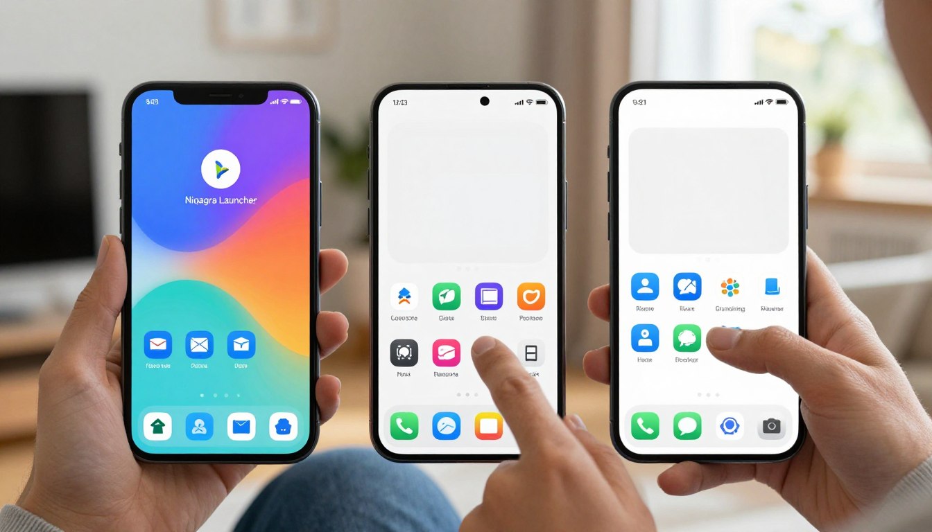
Niagara Launcher vs Minimalist Phone App: what each approach is really designed to do
How a home is built changes how you use your device every day. This section compares three clear approaches and what each is actually trying to fix.
List-first ergonomics for faster access
The niagara launcher uses a single-column favorites list and an alphabetical scroll bar. That design keeps the most used apps within thumb reach on large screens.
Its job: calmer home screens but quick access when work or family tasks demand speed. It favors organization over strict limits, so notifications still matter.
Strict restriction to cut screen time
The minimalist phone approach mimics a dumb phone: grayscale, text-forward labels, and built-in blockers. Timers and schedules add friction so distracting apps are harder to open.
Its job: reduce pickups by making bad habits inconvenient, even punitive for some users.
The default home as the baseline
A plain Android home screen relies on your discipline and Android Digital Wellbeing tools. It offers widgets and pages, which are useful but invite browsing.
In one line: organization, enforcement, or willpower. Pick the approach that fits your needs and the one you’ll keep using after week one.
Home screen design and daily friction: list vs text vs default grids
Design choices on the home alter the path from unlock to action — and that matters. The first screen you see should reduce accidental opens and help you reach essentials fast.
Vertical favorites and one-handed reach
A clean vertical list puts favorite apps in a single column, keeping most-used items within thumb reach on big screens.
A side alphabetical bar lets you jump instead of hunting through pages. That layout cuts visual noise while speeding access.
Boring on purpose: grayscale and text labels
A text-forward, grayscale interface removes color hits and flashy icons. Labels replace images so nothing tugs at attention.
This approach adds gentle friction: taps feel more deliberate, not automatic.
Default grids: temptation and clutter
Icon grids, widgets, and multiple pages create constant visual triggers. Even if you try to ignore them, they invite browsing.
What friction means for habits
Friction can be fewer visual triggers or slightly slower access to distractors. For someone juggling work and family, the aim is less accidental time-wasting, not making the device unusable.
Quick mental test: if a social service opens in one tap, you’ll likely tap it when tired.
App drawer, search, and shortcuts: how fast you can get to what you need
Fast discovery and deliberate friction change what you do after unlock. The app drawer and search tools decide whether you hit a task or drift into scrolling.
Alphabetical list and quick discovery
A single-column list with an alphabetical bar speeds things up. When you have many apps, jumping by letter beats endless horizontal swipes.
That list-style interface keeps essentials within reach and reduces the time you spend hunting on the screen.
Search-first access and curated fronts
Some systems make search the main route: type one or two letters and the right app appears. This model also keeps only a small set of apps front and center.
Everything else sits behind search or extra taps, which adds useful friction for compulsive opens.
Default drawers, tabs and swipe fatigue
Stock homes vary across brands: tabs, folders, or a single drawer. Those differences matter because more tabs mean more swiping and more temptation.
Shortcuts can help: quick actions save time for common tasks, but they can also become another layer to optimize and click.
Mini decision rule: if you use many apps daily, favor a fast drawer and robust search. If you want to cut pickups, pick an interface that makes nonessential items slower to reach. Speed for essentials, slowness for distractions—this balance creates better habits over time.
Notifications and alerts: the hidden driver of compulsive phone checking
What looks like random unlocking is usually a trained response to alerts. Sounds, badges, and preview text create tiny rewards. Over time they pull you into longer sessions without much thought.
Some launchers use adaptive notification grouping: bundle most items and surface them every few hours while letting urgent ones bypass grouping. That keeps the status bar tidy and shows only what truly matters.
The detox-first approach adds blockers, timers, and schedules. It makes distracting access harder during work or family hours. Timers and strict blocks protect evenings and reduce impulse checks.
Android’s system tools help: mute channels, turn off badges, and enable Do Not Disturb or Focus Mode. They can’t, however, remove every visual lure from the home screen itself.
Quick diagnosis: is your trigger a ping, a red badge, a lock-screen preview, or the “one quick check” habit? Start by muting social and shopping notifications. If you still drift, consider a launcher change to alter the visual cues.
Reducing interruptions is often the fastest, least painful way to cut screen time and regain focus.
Customization options and gestures: power features vs simplicity
Small interface choices change how often you reach for features and how smoothly tasks get done.
Practical tweaks that matter
Most people want two things: a clean home that still works. On that front, the niagara launcher supports common customization options: swap icon packs, resize icons, hide the status bar, and even remove the alphabet index if you prefer fewer visual cues.
Those settings keep the interface tidy without turning setup into a project. Use icon size and a single pack to make the screen readable and consistent.
Gestures: speed vs complexity
Gestures save time: double-tap to lock, swipe for search, long-press for shortcuts. They cut taps for frequent tasks.
But too many gestures make the phone feel like a cockpit. If you add lots of custom shortcuts, you risk building a system you must remember instead of one that helps.
What strict minimalism removes
Detox-style setups often drop gestures and automations. That can reduce fiddling and keep habits steady.
The trade-off: everyday workflows may need more taps, which frustrates users who rely on shortcuts for work or family tasks.
Brand differences in the U.S.
Stock homes also differ by system. Pixel’s default tends toward simplicity with fewer grid options. Samsung’s One UI offers more grid choices and extra home features.
That means a “plain” home on one brand may feel more configurable on another.
A quick guideline
Pick 2–3 customization tweaks that support a habit: larger icons for essentials, one gesture for search, and hiding badges you don’t need. Stop there.
When customization reduces steps to essentials it helps. When it becomes polishing icons, it hurts habits instead of helping them.
Setup time, pricing, and long-term stickiness
Changing how your screen works takes minutes to set up and months to stick. The real decision is not the install: it’s whether the change survives work, travel, and family routines.
Niagara Pro cost considerations
Niagara Pro typically offers a lifetime license near $30 and a yearly subscription option around $10. If you love the interface and plan to use it for years, the lifetime buy is often cheaper.
Choose subscription if you want a low upfront cost and the option to stop paying later without losing much time on setup.
Restriction tools behind paywalls
Detox-style systems commonly hide core restriction features behind subscriptions or a one-time unlock. Confirm the exact features you need—timers, schedules, or blockers—before you pay.
Plain home screen: free but effortful
The default home is free. The real price is ongoing discipline: constant notification tuning, removing shortcuts, and resisting impulse opens.
Common failure mode and quick checklist
Many users love ultra-minimal setups for a weekend and abandon them when work apps or rideshares need fast access. That’s the usual failure: practicality beats purity.
Quick setup checklist: favorites list, notification settings, and one essential widget (clock or calendar). Keep it simple so the setup saves time, not adds chores.
Who each option fits
Organization seekers: go pro for fast access and customization.
Detox seekers: pay for restriction tools if you need enforced limits.
Disciplined users: stick with the plain home and invest time instead of money.
Picking the launcher you’ll actually keep using (and the habit you’ll actually change)
Start by naming the single habit you want your home screen to support: less checking, less scrolling, or faster access.
Pick the tool that matches that habit. You’ll like this if: Niagara fits you for a clean list and quick access; a minimalist setup works if you want strict rules and guardrails; a plain home is best if you prefer familiar design and can tune settings yourself.
Try a 7–14 day test: keep the setup simple, track screen time, and note triggers—alerts, badges, or the app drawer/search pattern.
Starter home: clock, date, weather, and a short list of essentials. Success looks like fewer pickups, fewer opens “just because,” and more intentional use.
If it fails, treat that as feedback: adjust organization, add more enforcement, or reduce friction. The best choice is the one you keep using when life gets busy.

Noah Carter is a mobile tech writer focused on Android performance, minimalist phone setups, and lightweight app alternatives. He has spent years testing budget and mid-range devices to find practical tweaks that make everyday smartphones faster, simpler, and easier to use — without rooting, without bloat, and without unnecessary complexity. His work on News Mobile covers everything from battery optimization to accessibility setups for seniors.