I Used My Phone With Only 12 Apps for 30 Days — Here’s What I Actually Missed
Average people use a smartphone more than four hours a day and tap it about 344 times. That is our starting point: not blame, just a common baseline.
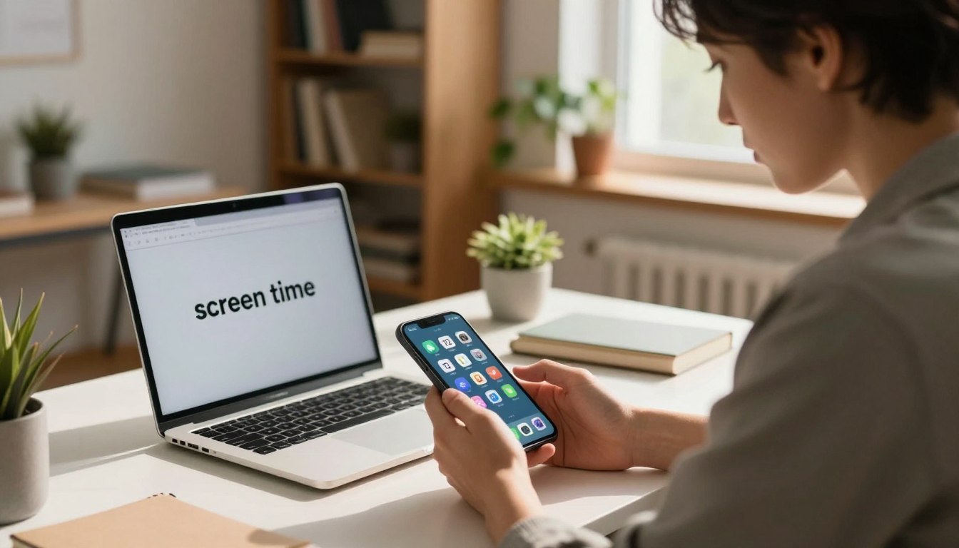
One phone, 12 apps, 30 days — that was the experiment. The aim was simple: observe what truly changes, not what theory says should change.
You will get honest results: real screen time shifts, how it felt to live with fewer apps, and the things that were surprisingly hard to give up. This reads like a product review and a field test.
Why now? Many want a calmer relationship with their device without tossing it out or buying a new one. The tension is clear: cutting apps seems easy, but empty moments ask for new habits.
By the end, you’ll know whether a minimalist setup fits your life and how to try it safely: layout tips, notification moves, and emotional takeaways to copy.
Why I Tried a Minimalist Phone Setup in the First Place
The idea started with a simple question: what if the device in your pocket stopped running your day?
Smartphone overuse is bigger than “bad habits”
This is not about weak willpower. Modern tech is designed to pull attention: bright icons, endless feeds, and constant pings shape our behavior.
People reach for the phone first thing, during commercials, and “just for a second.” Those tiny checks add up into a systems problem, not a personal failing.
The mental health and productivity costs I wanted to test
Excessive use links to worse sleep, more stress, comparison loops and low-grade anxiety that follows you through the day. That is the mental health angle I wanted to measure.
On the productivity side, context switching steals momentum. Even brief interruptions break focus and make tasks take longer.
The goal was practical: not total detox, but a lasting shift so the device becomes a tool that supports daily life, not the thing that runs it.
The Baseline: What “Normal” Phone Usage Looked Like Before the Reset
Normal use looked less like long sessions and more like constant micro-checks between tasks. That pattern quietly shaped the day: little taps, quick reads, and instant switches that broke focus.
On average, usage hit more than four hours across a typical day. Those hours weren’t one long block; they were scattered minutes that made work and chores feel heavier and slower.
Americans check their devices about 344 times daily, and that showed up in routine moments: waiting in line, during loading screens, between emails, and while watching TV. Each check felt small, but the sum was noticeable.
The home screen as temptation
The home screen operated like a nudge machine: badges, bright icons, and prime placement near the thumb. Social, news, email, shopping, and games clustered where they were easiest to reach.
Those distractions shaped mood as much as behavior. After an evening of fragmented attention, the mind felt tired, restless, and oddly full but not satisfied.
What this baseline will be compared to
This baseline of screen time, checks, and home screen triggers is the yardstick. Later, the 30-day setup results will be measured against these patterns to show real change in usage and distractions.
My Rules for the delete apps minimalist phone challenge
To make the experiment fair, a clear set of rules governed what stayed on the home screen and why. The goal was practical: keep tools that serve responsibilities and cut things that mainly filled time.
What counted as essential vs. clutter
Essential meant direct utility: communication, navigation, banking, calendar, authentication, and health or safety tools.
Anything that existed mainly to fill spare minutes, add background noise, or trigger impulsive checking was removed from quick access.
The 12-app home screen: how choices were made
The home screen held exactly 12 core icons. Everything else required a deliberate search or was uninstalled.
Selection rule: keep what saves time or supports real duties; remove what provides frictionless dopamine.
Keeping the test honest
No sneaky replacement scrolling in a browser to mimic old habits. The experiment banned casual workarounds so behavior change could surface.
Try this quick audit: list your top 20 most-opened apps, then circle what truly improves life versus what steals attention.
Key principle: fewer options mean less decision fatigue. Expect the first week to feel odd—the missing-app itch fades as new habits form.
The Interface That Made It Possible: Using a Minimalist Launcher as My Daily Driver
The way your screen looks shapes choices more than sheer willpower ever could. Changing the interface set the tone for every unlock and tap.
Why a launcher changes behavior more than willpower
A launcher changes defaults so you act with intent. Willpower wanes; design nudges persist.
With fewer distractions on the home view, reflexive checking dropped. The launcher acted like a gentle gate between impulse and action.
What a minimalist UI looks like in practice
Think: restrained color, a small set of icons, and no noisy badges or widgets. This design reduces visual noise that taxes the mind.
It creates productive friction: you can still reach what you need, but it takes a deliberate move instead of a thumb flick.
Why this matters
When the home screen stops acting like a billboard, your focus improves and you make fewer autopilot choices. A minimalist launcher won’t fix everything, but it makes the 12-item setup livable and sustainable.
Product Review: minimalist phone (Android) After 30 Days
Switching to a stripped-down launcher changed how every unlock felt within minutes. The setup is simple and the payoff is practical: fewer reflex taps, clearer intent, and calmer pockets of time.
Setup and first impressions on day one
Install from the store, set it as your default home screen, and expect an immediate “wow, it’s quiet” reaction. The first day your thumb will still search old icon spots; that awkwardness matters because it breaks autopilot.
Home screen design: reducing visual noise
The interface uses a list-based layout so the screen feels less like a buffet of temptations. One clear column, limited items, and no badges cut visual clutter and make choices slower and more deliberate.
Mindful friction: stopping mindless scrolling
Small added steps—one swipe or tap more—create gentle friction. That pause is enough to stop a reflexive scroll but not enough to make the device a hassle. Users report better productivity and calmer routines.
Battery life notes with dark theme and OLED displays
On OLED phones, using the dark theme with this launcher often shows measurable battery gains. The darker interface reduces pixels lit, so screen-on time can extend by noticeable margins.
Compatibility: Android 6.0+
The launcher supports Android 6.0 and up, covering the majority of active phones today. Anecdotes from Able, JJ, and A.W. highlight quality-of-life and ADHD-friendly benefits, framed as personal observations—not medical advice.
Overall: this tool acted as the enabler that made the 12-item setup stick across the 30-day run.
What Changed Most: Screen Time, Focus, and Peace of Mind
What stood out fast was not time saved, but the quality of the time I kept. Small shifts to how the home view behaved cut reflexive checks and made moments feel fuller.
Less context switching, more follow-through
Pickups dropped and so did the “what was I doing?” moments. Tasks lasted longer without interruptions, and projects reached completion in fewer sessions.
ADHD-friendly benefits I didn’t expect
A.W. said the setup helped with ADHD by reducing visual triggers. It’s not a cure, but it lowered impulse loops and gave clearer boundaries for the user.
My relationship with my phone felt more “tool” than “addiction”
Justin, a mental health therapist, noted the change repaired the device relationship. Less buzzing meant less urgency and more peace mind when the device sat nearby.
These shifts matter for habits and mental health: fewer triggers lead to less stress and steadier mood over the week.
Mirror question for you: if your device vanished for 20 minutes, would you feel free or itchy? That reaction tells you where life and mind stand today.
What I Actually Missed When I Ditched Most Apps
Once the home view lost its noise, a different emptiness arrived: boredom, and it arrived fast.
The boredom gap (and why it mattered)
Boredom showed up within the first few days. Without easy apps to tap, free moments felt oddly loud.
That silence matters because your brain treats it two ways: recovery or panic. The phone usually fills it instantly.
Social scrolling as a default “background activity”
Social scrolling wasn’t always intentional. It acted as a background habit while waiting, eating, or winding down.
Removing that filler exposed how much of the day ran on autopilot and small interruptions.
Friction moments: when convenience really was convenient
Some features truly saved time: event tickets, boarding passes, school messages, and two-factor codes. Needing a single app for those moments felt inconvenient.
The trade-off was clear: fewer distractions and calmer screen time came with a bit more effort to get certain things.
Practical takeaway: keep a short “allowed exceptions” list. Let a few essential items stay handy so your setup fits real life, not an ideal.
Minimalist Phone vs. Other Minimalist Phone Apps I Considered
Choosing how to cut distractions felt like shopping for habits, not features. Below is a short buyer’s guide that matches tools to real needs so you can pick without overthinking.
Minimalist Launcher: strengths for a clutter-free home screen
The minimalist launcher offers a streamlined interface, a simple app drawer, and a monochrome design that reduces visual noise.
Its clean design and restrained home screen nudge you to open only what matters and lower reflexive use.
Dumb Phone: multiple launchers for work, leisure, and bedtime
Some solutions let you switch launchers by context: work, leisure, or bedtime. That changes behavior by situation, not willpower.
ScreenZen: delays, locks, and streaks for breaking habits
ScreenZen adds friction: delays before opening an app, timed windows, locks, and streaks to reward steady progress.
When a kosher smartphone is the better fit than any app
If willpower fails often, a kosher smartphone with built-in restrictions makes sense. It reduces reliance on self-control while keeping essential tools on hand.
Decision filter: if visual clutter is the issue, start with a launcher; if you compulsively open things, add delays and locks; if relapse risk is high, choose stronger device limits.
How to Build a Minimalist Smartphone Without Feeling Deprived
Designing a phone that supports your day begins with a short, honest audit. List what you open daily and why. Keep only what helps tasks or safety, not what fills spare moments.
The “three-tap rule” for keeping only useful apps
Use this rule: any task you need often should take three taps or fewer. If checking a boarding pass, sending a quick message, or logging a receipt takes more, add a shortcut.
Examples: a direct dial tile counts as one tap. A bookmark to a transit pass counts as two. If a common action needs four taps, the setup is too strict and you’ll abandon it.
Notification cleanup and time-of-day boundaries that actually stuck
Start notifications with people first: calls and texts only. Then allow only what protects time or safety—bank alerts, calendar reminders, health notices.
Use simple blocks: work hours (allow work tools), evening (mute social feeds), bedtime (only alarms and emergency contacts). On weekends, loosen rules for social catch-up but keep bedtime firm.
Monochrome, dark mode, and reducing decision fatigue
Switch to dark mode and a mostly monochrome home to cut visual pull. A calm interface reduces the impulse to open things and helps focus.
Finish with a minimum viable set: communication, calendar, navigation, banking, and a notes/to-do tool for productivity. Add quick-launch shortcuts so essentials stay easy to use without undoing your new habits.
Minimalism is a way to make the device earn its place. Tweak as you go so the system helps your life, not the other way around.
What to Know Before You Commit: Plans, Privacy, and Getting Out Cleanly
Before swapping your daily driver, check three things: plan options, how data is handled, and clean uninstall steps. These points lower risk and make trying something new less stressful for people who value their routine and health.
Plans and trials
Most vendors offer monthly, annual, or one-time purchase models. Each option usually includes a free trial so a user can test the setup for a short period without committing money.
Pick the billing style that fits your time horizon: monthly if you want flexibility, annual to save money, or one-time if you prefer owning a license outright.
Privacy expectations
Look for clear statements in the privacy policy: does the developer sell personally identifiable information? The app examined here says it does not sell PII to third parties and that it is GDPR compliant.
If privacy matters to you, review permissions, data-retention language, and what information the app stores or shares before fully switching your device over.
How to exit or uninstall when you’re done
Good news: installation is standard and reversible. To leave from inside the app, open settings (gear icon on the all apps page) → More → Exit.
If admin mode isn’t enabled, uninstall directly from the Google Play Store: search the app name and tap Uninstall. That makes it safe to try—the option to return to your prior setup removes a common barrier for people testing change.
My Verdict: Who This Minimalist Setup Is For—and What I’m Keeping Long-Term
What stayed after the test wasn’t a list of tools but a habit of calmer moments. The quieter screen and fewer distractions gave a real sense of peace without turning life into a technology experiment.
Who benefits most: people who want better productivity and less reactive usage. If you want clearer routines and a gentler relationship with your smartphone, this setup helps you focus.
Who will hate it: users whose work needs constant rapid switching or many niche apps. Those setups add friction that makes tasks slower and frustrates fast workflows.
The biggest wins to keep: a simplified home screen, less visual clutter, and defaults that protect attention. Trade-offs are real: occasional inconvenience and fewer instant entertainment options.
Long-term plan: review apps monthly, keep notifications tight, and treat your device like a tool you configure. For mental health and overall health, these small moves can reduce stress and build better boundaries.
Try one change today: install a calmer launcher, clean notifications, or limit to a dozen core icons for one week. Test it, then adjust based on what improves your life and peace.

Noah Carter is a mobile tech writer focused on Android performance, minimalist phone setups, and lightweight app alternatives. He has spent years testing budget and mid-range devices to find practical tweaks that make everyday smartphones faster, simpler, and easier to use — without rooting, without bloat, and without unnecessary complexity. His work on News Mobile covers everything from battery optimization to accessibility setups for seniors.