Best Minimal Widgets for a Sleek and Useful Setup
This friendly guide helps you build a minimal widgets setup that actually boosts productivity and cuts distractions. You’ll learn a clear path: declutter, add only the essentials, refine design choices, and keep everything consistent.
Many iOS users now favor a focused home screen with just a few high-signal items. The primary screen can show Timepage for a glanceable schedule, Things for tasks, and Spark for a calmer inbox. Secondary screens hold Hey Weather, Apple News, and Photos while older widget pages keep Batteries, Fitness, and Screen Time.
Transparent, text-based launchers like Blank Spaces let you label quick links — for example “Capture” to open Drafts or “Mind Maps” to open MindNode. Blank Spaces hides labels and blends with wallpaper, and it works best with Reduce Motion enabled.
We cover both iPhone and Android tips so you can speed access to time, tasks, and key apps. The goal is simple: reduce decision fatigue, save time, and use your phone with purpose.
Why go minimal: focus, faster access, and less screen time
Reducing clutter on your phone turns dozens of distracted moments into useful minutes. The average American checks their device 344 times a day, so small changes add up fast.
Authors Jake Knapp and John Zeratsky warn about “infinity pools” and the “busy bandwagon” — endless feeds and constant alerts that fragment attention. By removing email from the front page, prioritizing glanceable info, and using Focus or Do Not Disturb, you stop many interruptions before they start.
When the home and main screen show only high-signal items, you cut taps, swipes, and random browsing. That gives you more control and boosts productivity by surfacing your day’s schedule, tasks, and weather at a glance.
Try tiered notifications: keep urgent channels active and defer the rest to scheduled check-ins. These changes save minutes daily that compound into real time over weeks and years, and they make it easier to notice when you slip into mindless scrolling.
Map your essentials before you build the home screen
Map your daily essentials first so your home screen supports real decisions, not noise. A quick plan saves taps and keeps focus on what matters each day.
Define your must-see data
Start with a short list of items to view at a glance: time and date, your calendar blocks, top tasks or a short list of todos, current weather, and priority email. Add space for notes or a quick note capture so you can jot ideas without opening many apps.
Assign each data type to a single widget or launcher. Visualizing those placements helps you avoid overcrowding and ensures each element serves a clear purpose.
Choose a simple layout model
Pick one primary productivity screen that shows calendar, tasks, and time for the day. Make a second “good-to-know” screen for weather, news, and photos. Put everything else in the App Library and use search for fast access.
Limit visible apps and choose compact options for weather that show now and the next day or two. Keep email exposure controlled so it nudges action without creating distraction.
minimal widgets setup: a step-by-step pathway
A practical path lets you pare down your home screen and keep only high-value items. Start with a quick audit, then add a few focused tools and refine over time.
Declutter first
Clear whole pages and remove nonessential apps so the primary home screen shows just core tools. Aim to keep about 10 visible app icons across your pages and send the rest to the App Library.
Turn off most badges and notifications so red dots stop pulling your attention. Keep only truly critical channels active.
Add high-signal widgets and links
Add a calendar widget for schedule-at-a-glance, a tasks widget for today’s list, and a weather widget for planning. Use focused launchers or text links to open an app quickly without extra icons.
Try Timepage, Things, Spark, and Hey Weather as your first choices. They deliver high signal with little noise.
Test, tweak, and iterate
Experiment with widget size and placement until the layout reads in one quick glance. Match background color and theme across elements so the design fades into the wallpaper.
Hide or shorten icon and name labels to keep attention on content. Live with changes for a day, then adjust. Small tweaks add up — repeat until the home screen speeds your routine.
iPhone how-to: minimalist widgets and launchers that reduce distractions
Keep your iPhone home screen purposeful by choosing a few glanceable tools that cut noise. This short guide shows which apps to add and how to arrange them so checks are fast and focused.
Calendar at a glance
Use Timepage to show the date, day, and upcoming events so your schedule is visible without opening the calendar app. Pick a dark background to match other elements and set the size so the clock and date read at a glance.
Tasks and email without noise
Surface today’s tasks with Things so small chores don’t slip. Let larger projects live elsewhere.
Configure Spark to mute most badges and only show counts for priority categories like People. This keeps email prompts meaningful and reduces distraction.
Weather, news, and moments
Combine a small Hey Weather widget for the next five hours with a medium one for the next three days. Choose a template and background color that match your theme.
Add Apple News for Top Stories and a Photos widget for a quiet rotating image that warms the screen without adding noise.
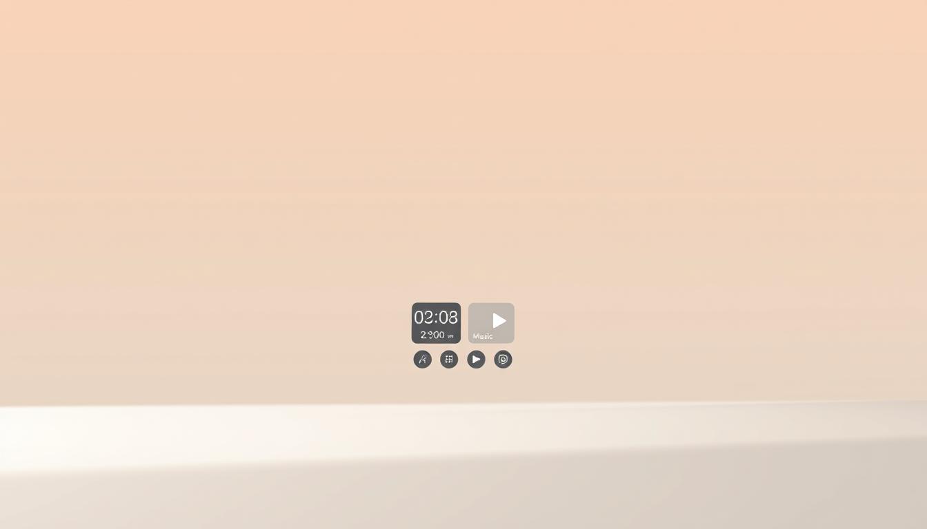
Go ultra-clean with Blank Spaces
Install Blank Spaces and add links with text labels to open app pages or run Shortcuts instantly. Use the small top widget for date/day/clock and the larger middle widget for a short list of action links.
Hide the app name beneath icons and import a home screen screenshot into Blank Spaces to align the transparent background. Enable Reduce Motion so the transparent effect feels seamless and taps to open app links stay fast.
Android picks for a clean, capable home screen
A tidy Android screen highlights time, weather, and quick controls so you spend less time hunting. The right apps and controls deliver glanceable facts and fast actions without crowding the layout.
Best weather options
Start with Weather Eye for the best weather experience that stays simple and crisp. It ships with 12 icon sets and supports custom icon packs so you can match your theme and icon style.
Quick info at a glance
Use Minimal Reader to scan headlines from the home without opening an app. Its pop-up reading and offline mode keep you informed while protecting focus.
Pair that with Minimal Clock as a small, elegant clock widget that won’t dominate the screen but remains readable at a glance.
Power controls that match the look
Place Power Toggles where your thumb can reach it for instant access to system switches. It’s free, ad-free, and built for fast control.
Consider SDS Clock for a 4×1 clock and date display that aligns with a minimal grid and pairs neatly with power controls.
Mix these apps and elements to create a cohesive screen: time, forecast, headlines, and power all in clear spots. Use search for everything else and review weekly to keep the home page fast.
Styling, widget size, and notification control for a cohesive look
A unified visual rhythm on your home helps your eye find time and priority items faster. Start with a small rule set and apply it consistently across the home screen.
Visual coherence
Pick one or two sizes and stick to them so the grid looks intentional. This makes scanning for the clock or tasks immediate.
Match icon style and color hues. Use a single background tint for widgets so no element shouts. Consider hiding the app name where possible to keep typography clean.
Place the most time-sensitive info near the top center and less-critical elements at the edges for a clear hierarchy.
Master attention
Limit notifications to a narrow set of urgent apps and people. Rely on Focus or Do Not Disturb to gate alerts during deep work or downtime.
Audit badges weekly and remove taps that prompt compulsive checking. Fewer, higher-quality prompts improve productivity and reduce friction.
Make it stick: review your layout, trim distractions, and keep your home screen calm
A quick weekly review helps your phone layout stay lean and calm. Spend a couple of minutes to remove an app or a widget you never tapped. Track what you open each day and prune what slows you down.
Keep a simple checklist: weather, calendar, tasks, email. Rename or refresh links so every open app action matches your goals. iOS users often keep three home screens; Android users stick with a few core tools like Weather Eye and Minimal Clock.
Use screenshots or short video walk-throughs to compare versions. If screen time rises, trim news and social items and tighten Focus rules. Small edits now save minutes and keep your home screen working for you.

Noah Carter is a mobile tech writer focused on Android performance, minimalist phone setups, and lightweight app alternatives. He has spent years testing budget and mid-range devices to find practical tweaks that make everyday smartphones faster, simpler, and easier to use — without rooting, without bloat, and without unnecessary complexity. His work on News Mobile covers everything from battery optimization to accessibility setups for seniors.